Now Booking Projects for Q3 2024
Menu
Contact
Start a Project
Close
Start a Project
Five star
Restaurants
, five star design
Browse Our Work
Featured
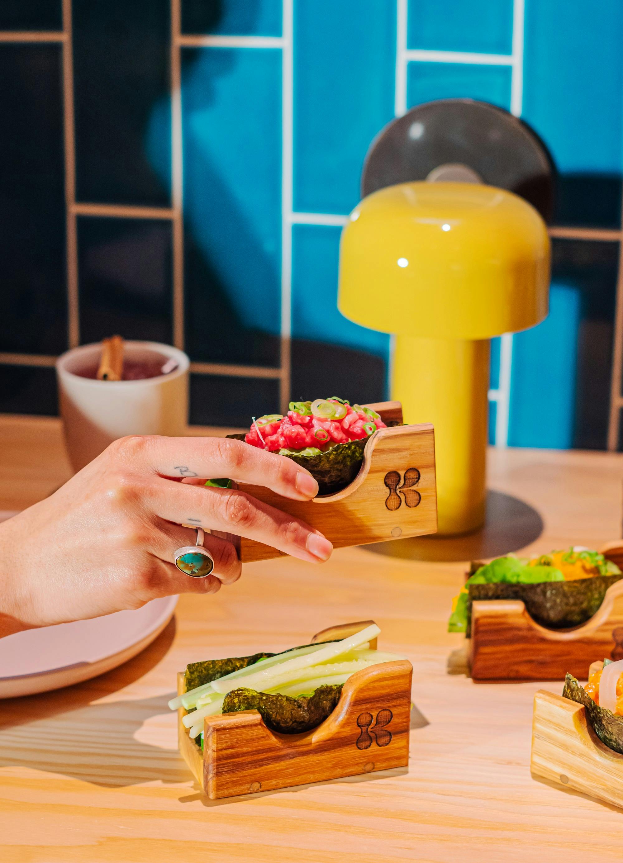
KPOD Stephen Starr Restaurant Branding
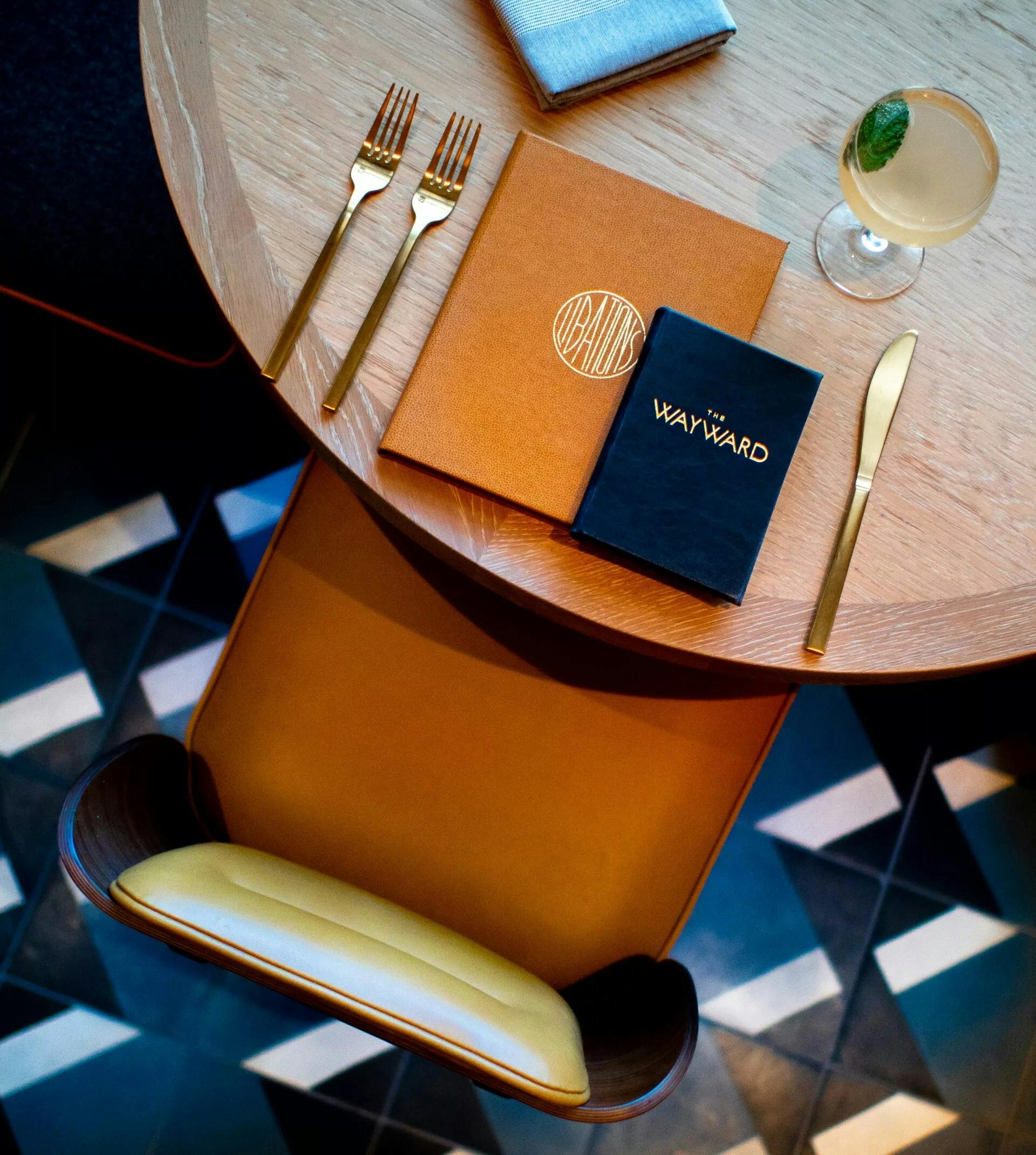
The Wayward Restaurant
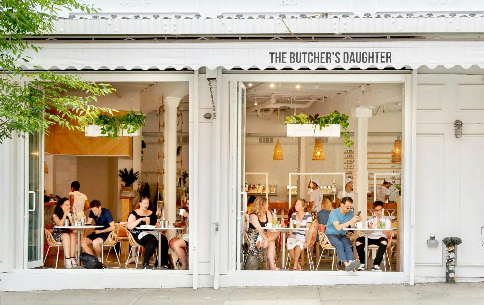
The Butcher’s Daughter Williamsburg Brooklyn
Alimentari Bar Branding
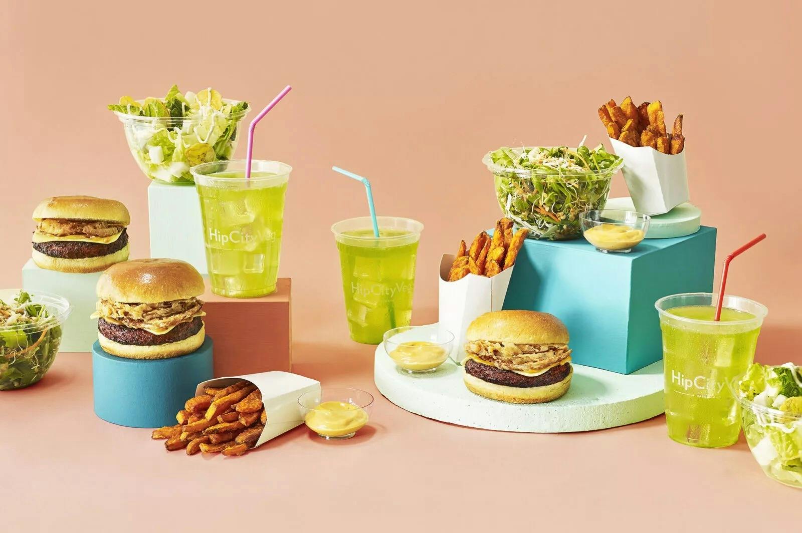
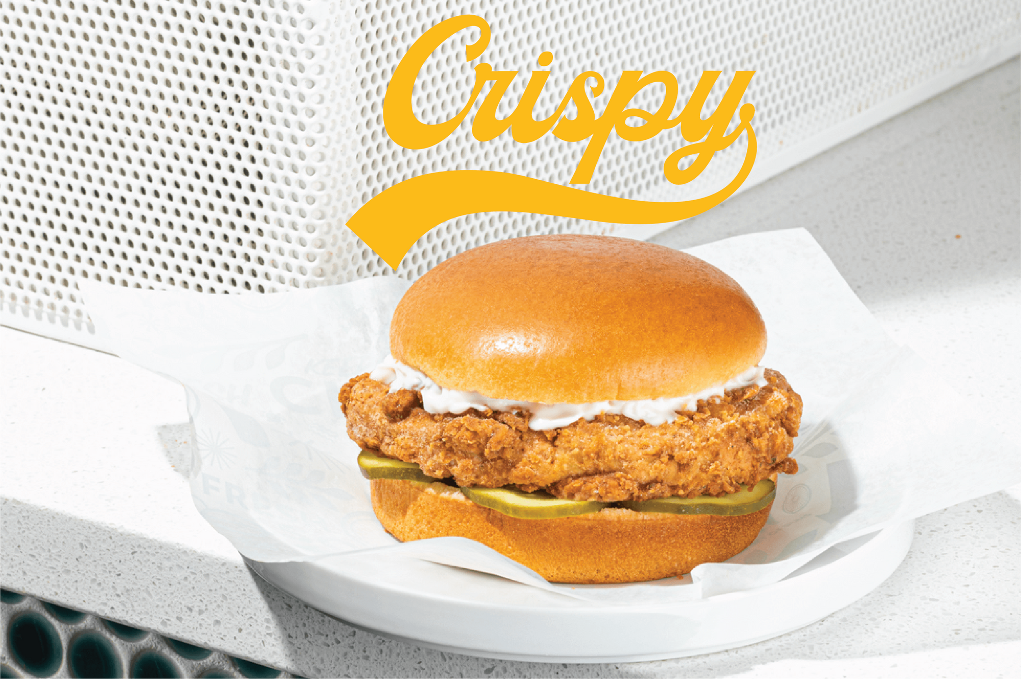
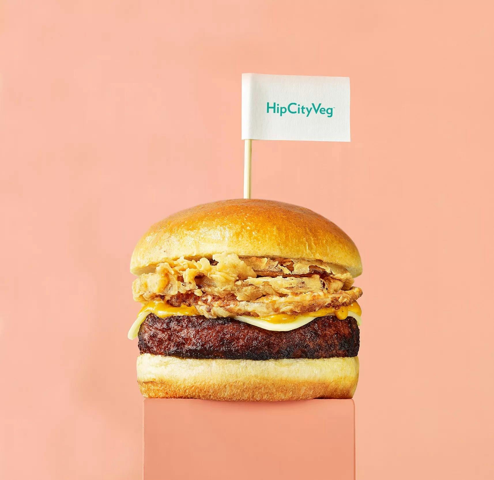
HipCityVeg Fast Casual Branding & Marketing
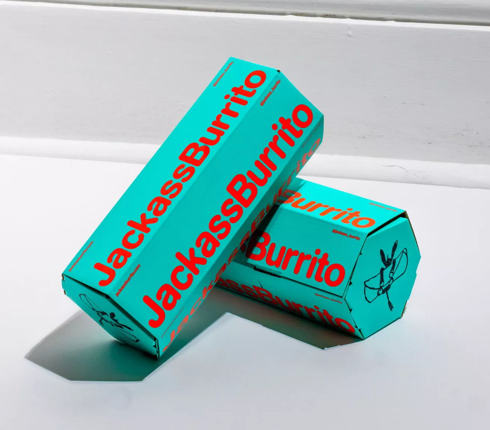
Jackass Burrito Starr Restaurants Ghost Kitchen
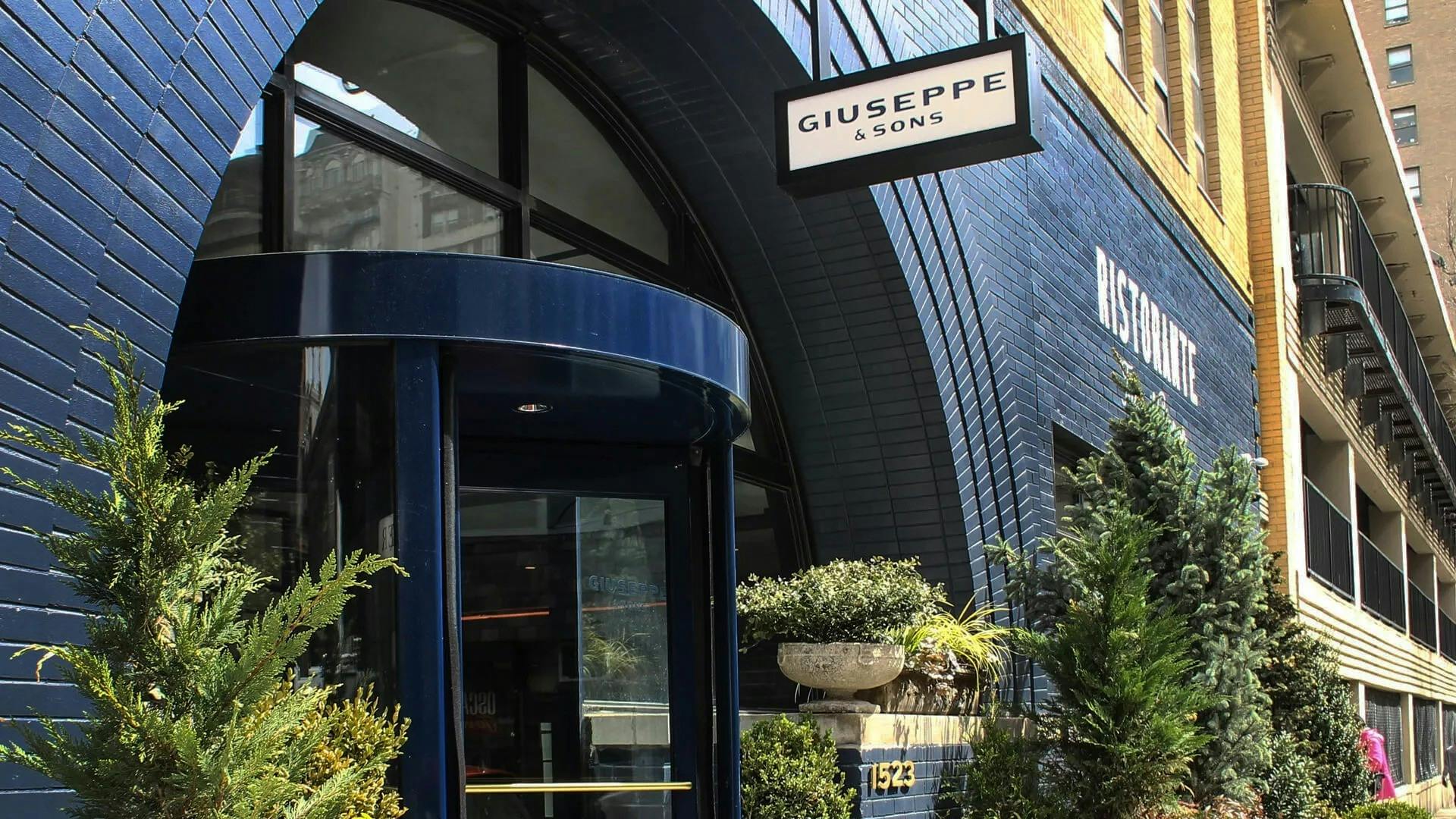
Giuseppe & Sons Italian Restaurant Brand
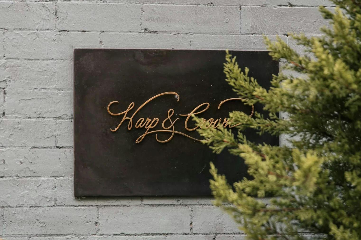
Harp & Crown Restaurant Branding
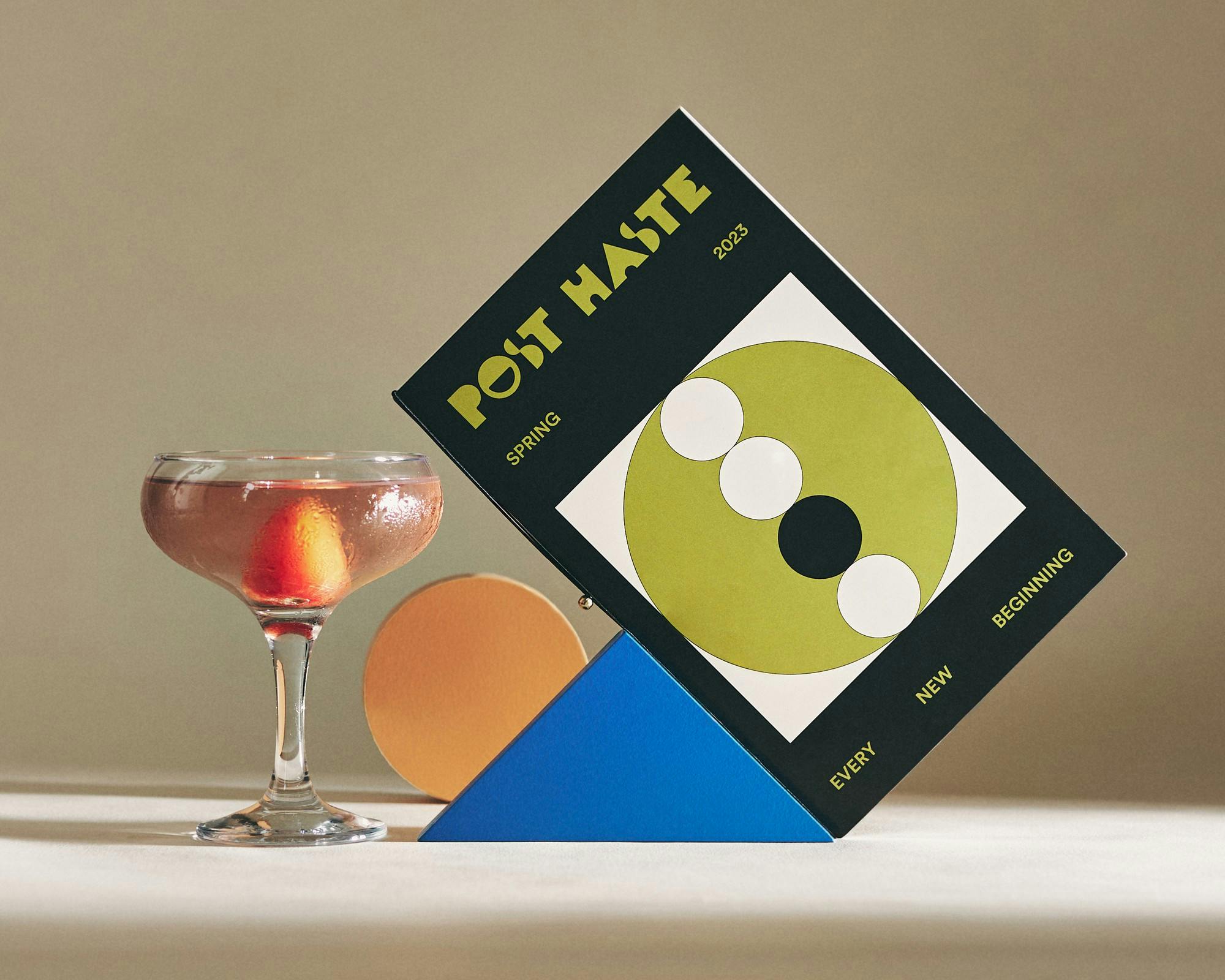
Post Haste Cocktail Bar Branding
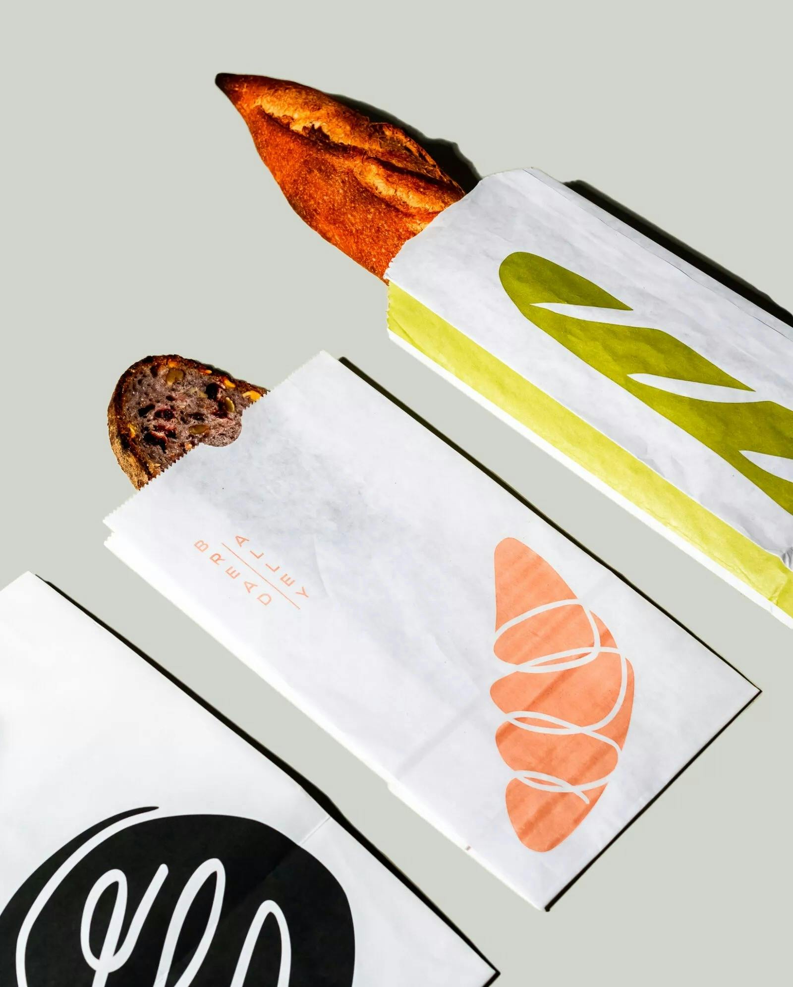
Bread Alley Micro-Restaurant
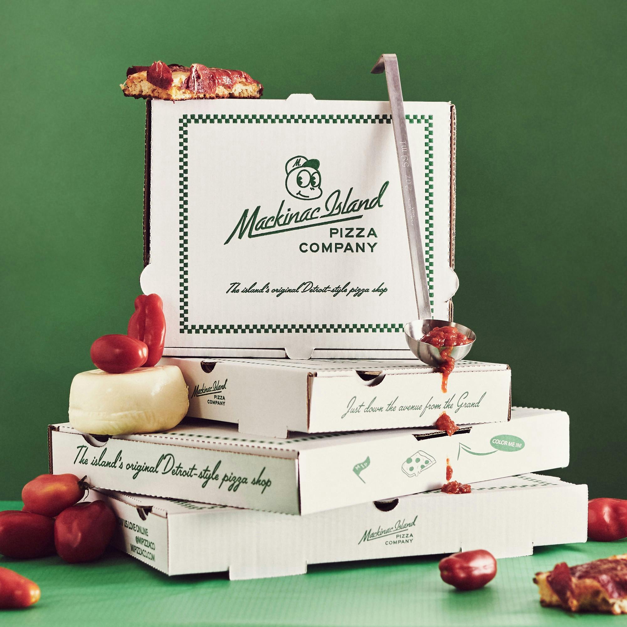
Mackinac Island Pizza Co. Branding
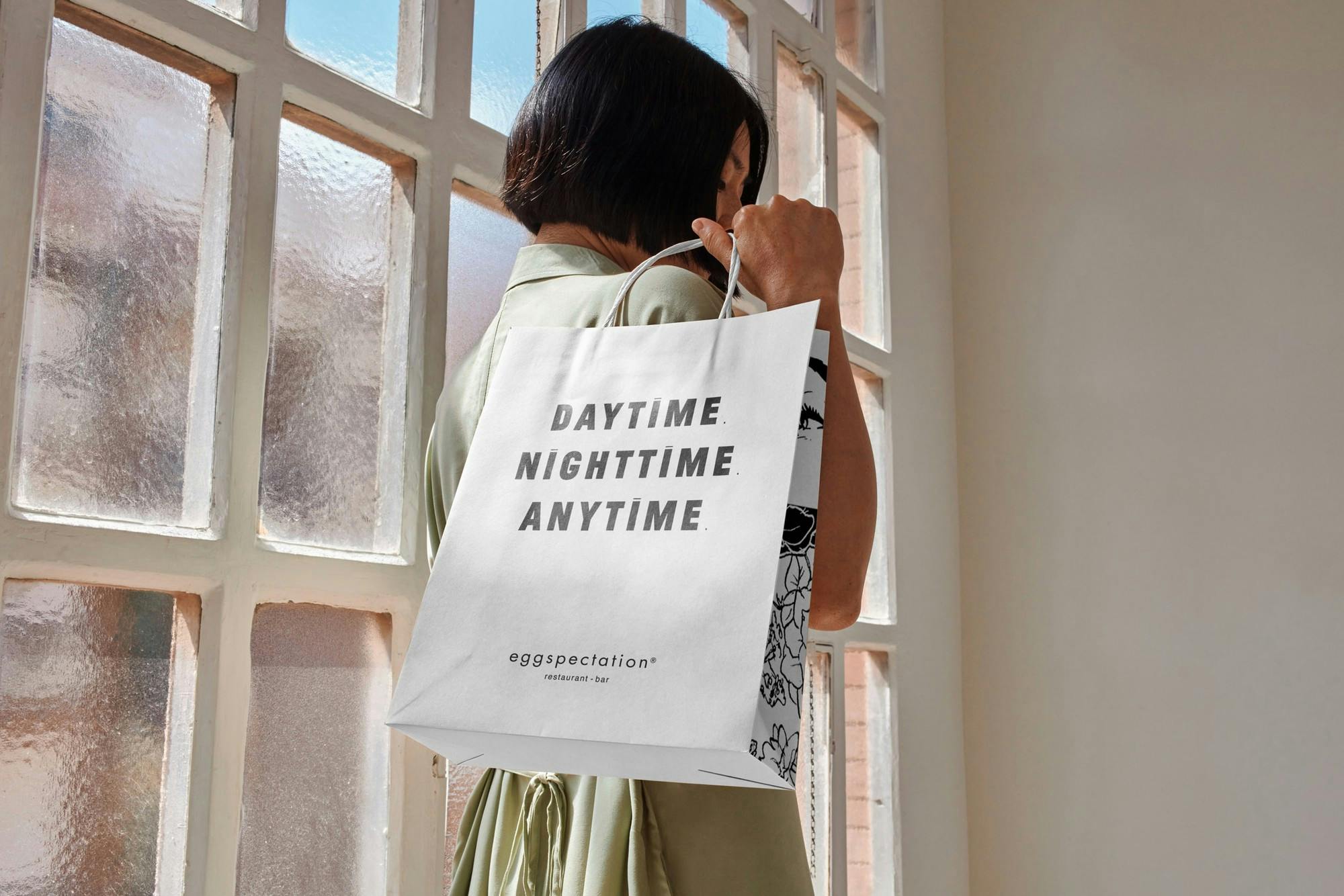
Eggspectation Brand Refresh
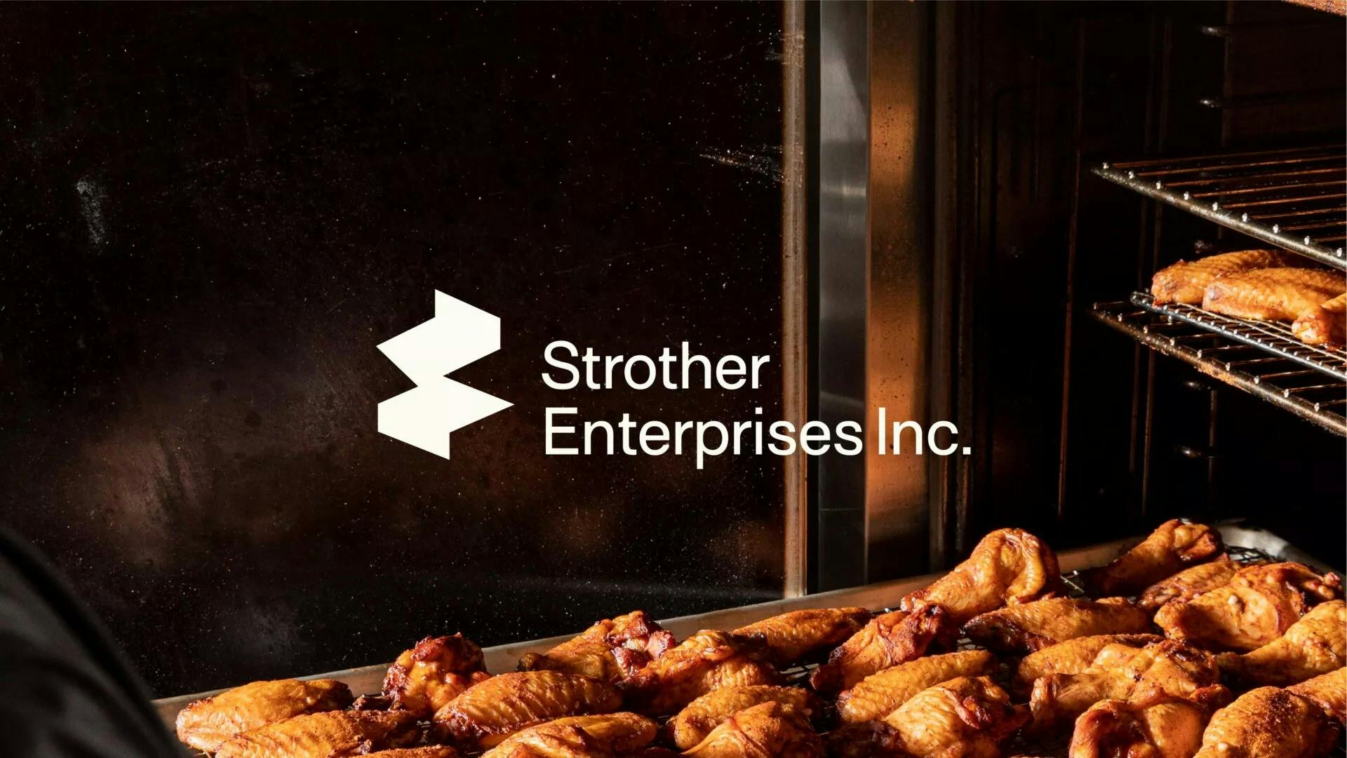
Strother Enterprises Corporate Rebrand
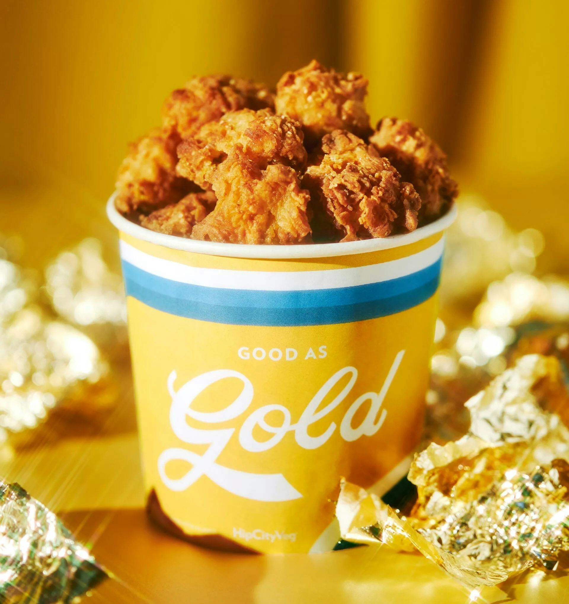
Golden Nugget Vegan Campaign
Starr Holiday 2022 Campaign
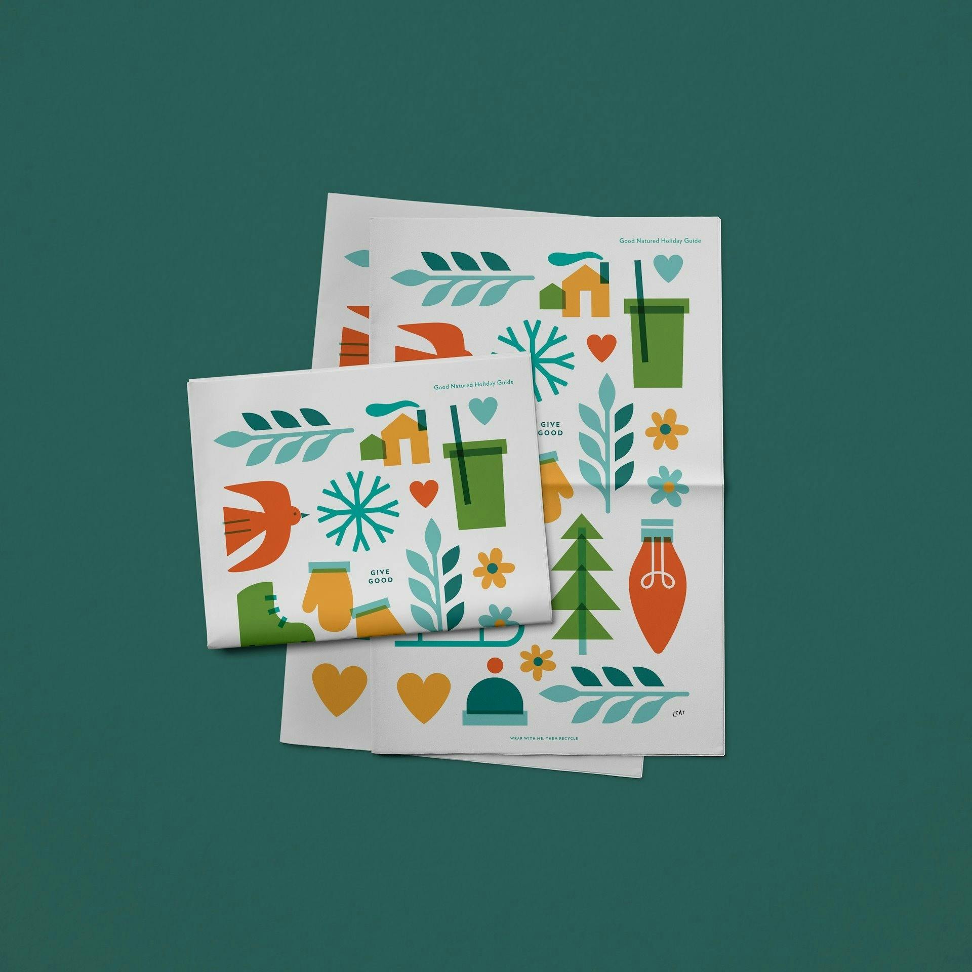
HipCityVeg Sustainable, Vegan Holiday Gift Campaign
HipCityVeg New Menu Launch
Our Clients
Alfred Restaurant Group
Davidson Hospitality
Marquis & Co.
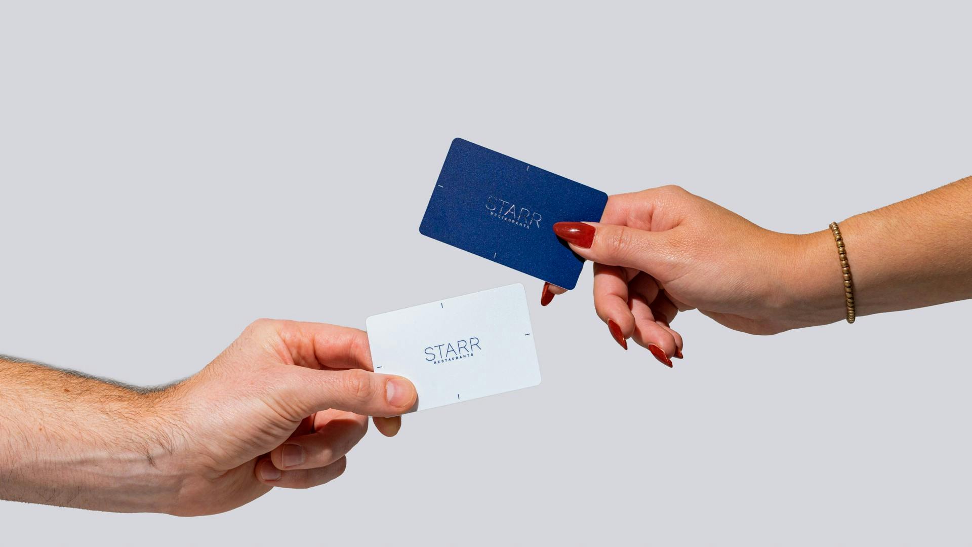
Starr Restaurants
Schulson Collective
Tender Greens
The Butcher's Daughter
Riverwards Produce
Sweet Lady Jane
Choice Market
Honest Greens
Mamahuhu
Canyon Coffee
Join the Fam
HipCityVeg "Basically A Salad" Campaign
Bitter Melon Restaurant Content and Marketing in Toronto
Site created in partnership with
Studio Hyperlink